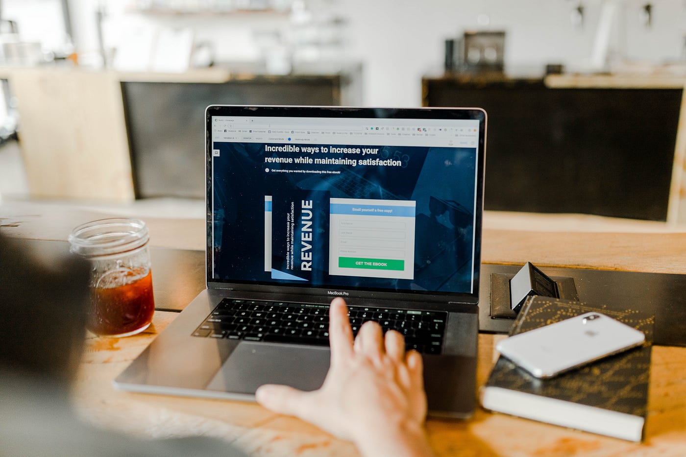
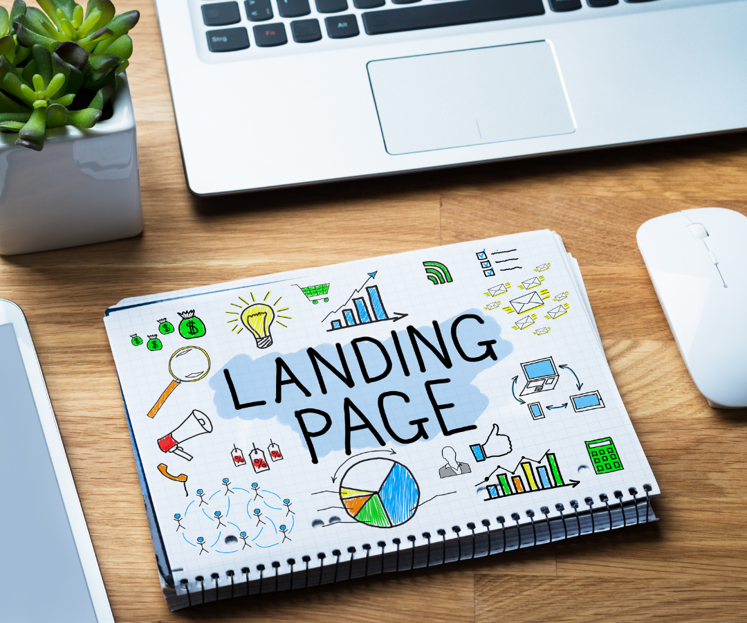
When you make an offer, you can enhance its chances of being taken up tenfold by making sure that your sales page has some key elements in place.

Most speakers, authors and coaches ‘throw together’ their landing, sales, and opt-in pages (they are actually all pretty much the same thing — they all make an offer of some kind. Sales pages in particular are focused on converting people into raving fans and even better, paying customers! So why do you leave the most important part of creation to the end or stop getting creative with that part of the ‘product’?
The place that introduces the product to someone is a vital component of the process and deserves time and energy spent on its creation. That’s why we want to share the elements that you need to consider using to make your offer land and get those conversions happening.
Get the TECH elements right
You can have the information on a stand-alone page (using landing page software) or on your website. We highly recommend that a lot of the smaller products you have do have a separate space on the web and are not part of your website. You want people focused on just what you are offering, without going off to check out all sort of other links on your site. You want their sole attention on your page. That’s what makes stand alone pages so much more converting. There’s no other decision than a yes or a no, there’s no distraction.
Once you’ve created your page, you need to make sure everything on it works — check all the links go through to where they are supposed to. Do the payment buttons work? Does the link take them to the document that’s been promised?

Part of making sure you’ve got everything set up includes writing the email follow ups. As well as checking the buttons and links work, follow the process right the way to checking that you receive the ‘product’ — whether that’s a lead magnet or that email telling you the product is on it’s way (if it’s physical), or in the inbox, or indeed confirmation of dates for a workshop or coaching consultation. Read them as if you were your client — check for typos and just common sense ‘logic’ — does what you’ve written make sense.
n addition, make sure you’ve created and branded any associated pages (for upsells for example, or at the very least, a thank you page that you put to work — we always invite people to join our FB Group.
Some tips to increase the effectiveness of the sales page
We get asked a lot about just what a perfect sales page looks like, and the true answer is that there is no standard answer. Firstly, it really depends on your brand & your style — are you more of a video person, or prefer writing or images. That might mean the difference between a long and a short page. Much of it depends on the product itself, even if it’s a free thing. If it needs more explanation, give it the attention it deserves. If it’s a no brainer, keep the page simple. Most of all, know (or learn) what format your ideal client avatar likes. Because they are the ones that are going to be interacting with the page.
That may even mean you do some ‘split testing’ of different versions of your pages. You can long vs short sales pages, lots of testimonials vs whiteboard illustration of results — anything is possible. Do look at other experts in your industry that you respect & mimic what you like about their pages — but don’t just rely on that! You still need to check your stats and understand whether your pages are working for YOU and your avatar!
So much of the time, we find that people miss out some of the key ingredients from this list. That’s going to make the difference between people taking you up on your offer or not. Sales pages may not be sexy, but they are the life blood of a lot of your business, so we urge you to take the time to get them right. And don’t just forget about them and leave them to it. Check on the stats regularly and adjust them accordingly. If you need help on what to write, check out this blog.
